
This chart compares the annual mortality rate in two groups of states: those that expanded Medicaid and those that didn’t. Prior to Obamacare, there was little difference between the two groups. After Obamacare, the group of expansion states experienced steadily declining mortality:
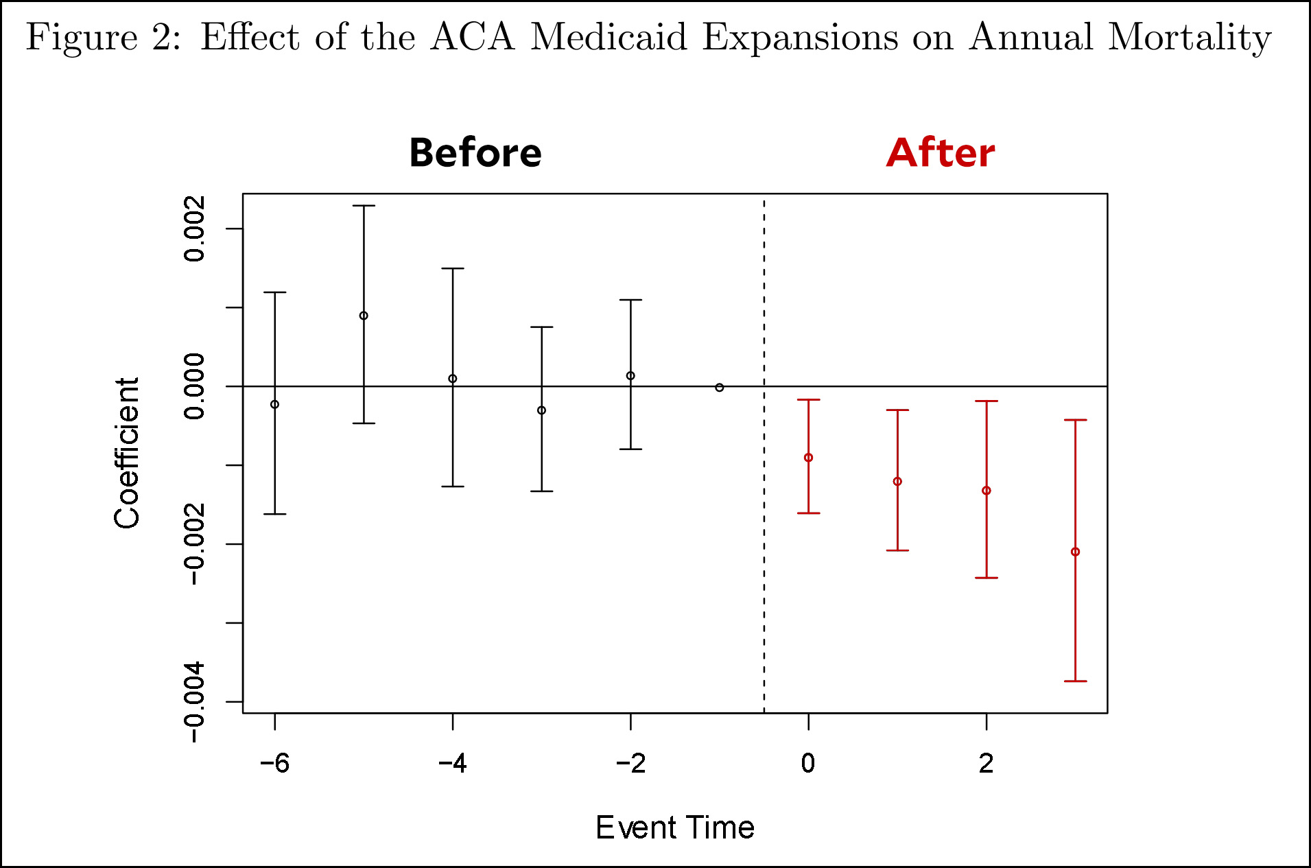
The authors of the study say this: “We find a 0.13 percentage point decline in annual mortality…associated with Medicaid expansion for this population. The effect is driven by a reduction in disease-related deaths and grows over time. We find no evidence of differential pre-treatment trends in outcomes and no effects among placebo groups.”
In the non-expansion states, they estimate that over a four-year period an extra 15,600 people died who didn’t have to. And it was all for the sake of ideology. Every one of these states was paying for Medicaid expansion whether they liked it or not, and participating would have cost them almost nothing. But they had a point to make, and if some people had to die to help them make that point—whatever it was—then that’s how it had to be.